mapping
resilience
We are living in a time of crisis. The proposed term of Anthropocene states a change of eras in which the climatic change is not only recognised, but also ubiquitous. Following Bruno Latour’s Grifford Lectures, it has been seen that the scientific expertise of thousand of researchers could not help to stop the looming ecological cataclysm. On a political level almost no efforts have been made, which is fittingly called the climate weirding. Latour describes that necessary decisions cannot be expected from the sciences, instead it is only a political task.
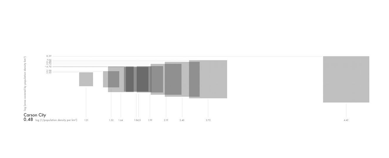
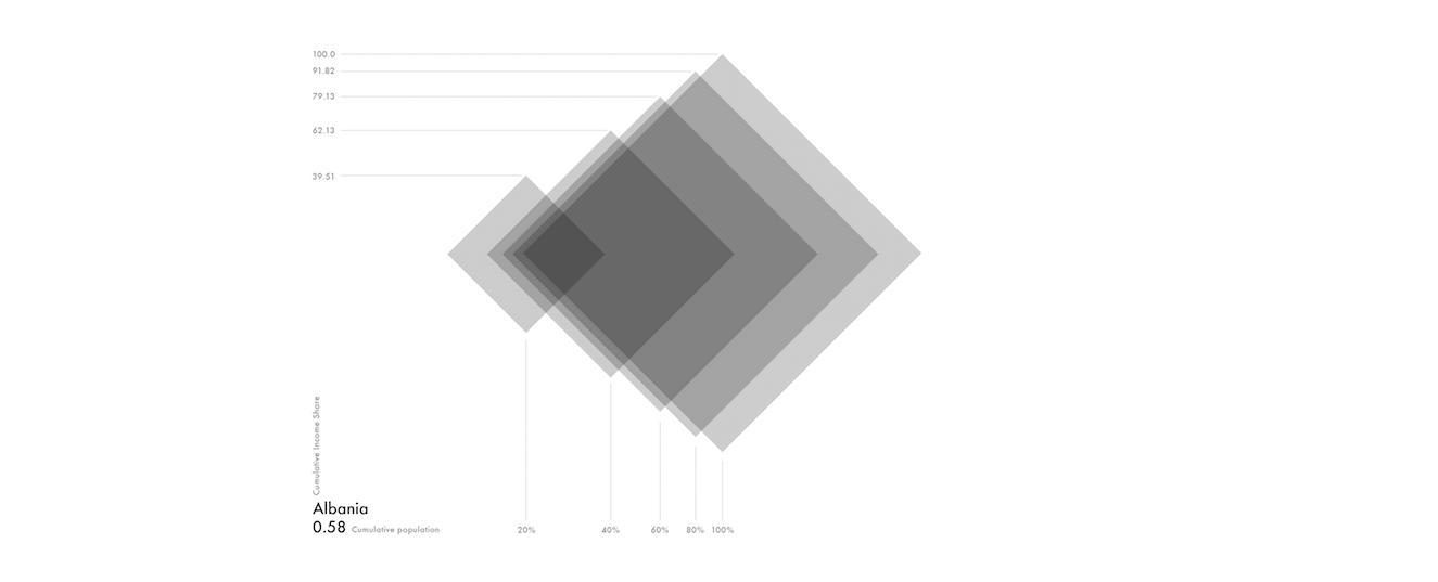
In cooperation with Fouad Khan, who developed a mathematical scaling indicator based on complexity for assessing resistance of cities and states regarding climate change mitigation, I was able to abstract his calculations into visual models, which in the end could be a crucial interface for policy makers and urbanists.
2015

Background
Fouad’s theory of a scaling indicator is based on the notion of resilience. Originally, the term resilience comes from a psychological background, where it describes a person’s ability to cope with change in any sense. In the case of climatic change, it can be transferred to resistant structures towards unpredictable climatic events within cities and national economies, also called critical infrastructures. So contrary to a more short-term and maybe naive sustainability concept, resilience tries to apply a more long sighted approach in terms of urban planning.
Since resilience stays a quite nebulous concept, Fouad deconstructs the notion into essential parts. The first one is disparity. Regarding urban planning, being disparate means an strong spatial inequality of low-density housing and high-density housing. By analysing data from various cities and national economies, Fouad developed a scaling indicator which values the disparity of each anthropogenic system. While seeing this cities and national economies as complex systems, Fouad’s applied fractal analysis with the resulting fractal dimension remains quite abstract.Thus, I developed for each system, cities and national economies, visual data models which are easier to comprehend for the target group. My concept was to rely on very simple shapes and natural gestalt principles, so that without any insights about the calculations and just through visual effects like overlapping and closeness/distance one is able to comprehend how disparity is distributed within different cities and national economics. Therefore, I was heavily inspired by systems art and color field painting.

Aftermath
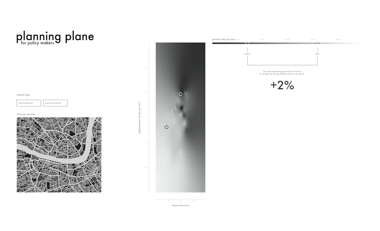
The concept of the eventual planning plane is to create an interface that helps to understand the consequences of urban development in regard to resilience. The tool itself is a visualisation of the behaviour of three variables in relation to one another. Basically, the policy maker can put in a urban development proposal via a GIS map or a already calculated scaling indicator. Then the tool calculates the new scaling indicator and population density (x and y-variable). Consequentially, from the new position on the plane the policy maker can see the new energy efficiency, which is the color coded z-variable.
Eventually, the policy maker gets a direct textual feedback about the results in terms of energy efficiency regarding his proposed urban development plans. Thus, the tool is a straight help for concrete political decisions, which in the end hopefully leads to more resilient urban environments and a safer and more grounded life in the Anthropocene.